what ways does your media product, use, develop or challenge forms and conventions of real life media products?
View more presentations from chloegs.
How effective is the combination of your main products and ancillary tasks?
Our brand image was designed to reflect the genre and also the storyline. We wanted the brand image to be clear and recognizable. The brand image is social realism dull and low colour, mixed with a sinister look to portray the theme of revenge in the storyline.
We achieved this look by taking images of the protagonist in the location of the trailer- the cobbled back street- as this clearly showed what genre it was whilst fulfilling the dull and low colour look we wanted.
We also kept the costume the same throughout the poster, magazine cover and during filming. The costume was black as she is a sinister character and the leggings and leather jacket were fitted and sleek to giver her sex appeal.
The wall and cobbles in the pictures were practical as they provided a good canvas to put our text on which saved time, and it also provided a contrast to the red text we used.
 We found the text font 'base 05' on ‘www.dafont.com’, along with a few others but this one was chosen as it looked worn down, giving connotations of the social realism poverty theme, whilst still being clear and bold which was important as the title of the film also acts as our logo within the brand and so it was important that the font was clear and easy to read and recognize. The font also looked slightly like blood splattered which gives connotations of what happens in the film and also has reference to the blood present in the trailer.
 The word ‘vendetta’ means revenge and so this is how we came up with the title. The word works as the logo as it is short and has three syllables which makes it catchy and easy to remember. The film title’s meaning, not only reflects the brand image as it gives connotations of the storyline, but the whole image created through the colour and font fits the brand’s image of social realism’s themes of poverty mixed with a blood and horror aspect and revenge.
To maintain this brand image across all of our products we kept most elements the same. The editing of the pictures was similar to the colour grading of the trailer. The colour was reduced and the brightness was reduced, whilst the black and contrast was increased. This made both the pictures for the magazines and posters and the footage for the trailer look grey dark and dull- something that fitted our genre and a key aspect within our brand image.
The font (base 05) was also used in all products.
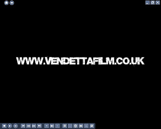
 It was used in both posters, and was the key font on the magazine cover although a second font was used for the magazine cover as we had to make the cover as close to an ‘Empire’ magazine as possible. The font was even used in the trailer at the end when the trailer finishes with ‘coming soon’ and ‘www.vendettafilm.co.uk’.
  In the trailer however red was not used, instead the text was white. This was because the text was on a black background and we felt the text stood out clearer and made more of an impact when it was white and as the same font was used we felt the brand image was still present in the trailer.
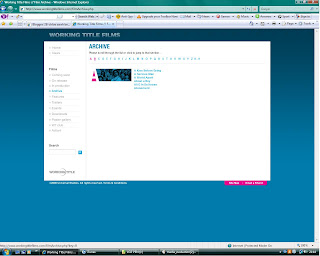
 Working Title films is a British film production company based in London and has produced films similar to ours, such as Billy Elliot which is also a British social realism film.
They have produced many British films that are not social realism films and so this would be the perfect production company for our film as our film is British social realism but has elements of other genres for example action and thriller. Despite being a British production company, Working Title films is a major competitor with Hollywood and has a good budget which again makes it ideal as it allows the marketing and profit of the film to be as big as Hollywood films.
This company would be likely to back our product as it has backed many similar products in the past. It produced ‘Shaun of the Dead’ which is a mixed genre film of comedy and horror, and it also produced the film ‘About a Boy’ which is also a mixed genre film of comedy and social realism. As our film is also a mixed genre film and of genres (social realism and horror/thriller) they are used to producing this would make them more likely to produce our film. Because Working Title films is a British film company and our film is a British, this would also make them more likely to produce our film as the majority of films they have produced in the past are British.
Our film has a wide target audience of 16-25s year olds however despite being a British social realism film; it appeals to this target audience of all nationalities as it has element of action and thriller which appeal to people in all countries, which makes it more appealing for a production company to fund.
Finally, I feel the brand image we have created is successful and would work as a real product. The brand image is realistic and similar to real products already on the market.
The brand image for Billy Elliot is very similar to our brand image. The footage in the film has been given a dull, blue-grey colour wash similar to the dull grey colour grading on our footage.
The pictures are of the protagonist in a typical British location that is also present in the film just as our images for the posters are also of the protagonist in a typically British location.
(MORE TO BE ADDED, PROBLEMS WITH UPLOADED PICS ONTO BLOGGER, WILL BE TRIED LATER OR TOMORROW AT COLLEGE)
Media Technologies Used
 During the planning and construction I used a number of media technologies some of which I had used before, and some that were new to me.
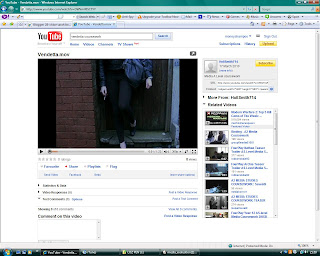
  www.youtube.com was used to look at trailers of a similar storyline and genre to ours so we could get inspiration and make sure our product was as realistic as possible. We looked at trailers to get inspiration and to gather common conventions of our genre and what we need to include in order to make ours successful. Youtube was very easy to use and all trailers we searched were on the website. Youtube also allowed us to put videos on our blog by copying and pasting the embed code. We also put our finished product on to get feedback and to get an embed code so we could present our final product here on our blog.
 Below is the trailer for Billy Elliot- just one of the many trailers youtube allowed us to view.
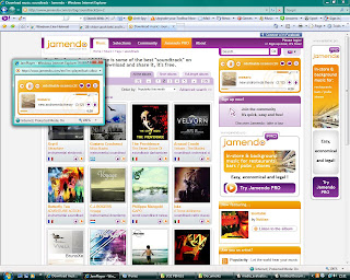
Another vital website used was www.jamendo.com . This is a creative commons music website. We found the soundtrack for our trailer on here. Although it was easy to listen to and download tracks from this site, I felt it was very time consuming finding the right track. There were search catagories such as music genre to narrow down our search but it still took a long time to go through possible tracks until the final track was found. The quality of the track (Wasuru- Undefinable Scenes) was very good and worked well when put onto Final Cut Express.
 This print screen shows the website and the track we used. When a track was selected a pop up box appeared with the track,pause, play, fast forward and rewind tools on which made it easier to skip to different parts of the song in order to get a gist of the song as quickly as possible.
The site was very clear and colourful and simple to use.
http://www.dafont.com/ was also important during the editing and creating of our products. On here we found our logo font 'base 05' and the EMPIRE font for the front of our magazine.
This site also has catagories to narrow down the search e.g horror text and so it made it easier to find a suitable text to fit our products brand image.
Whilst looking through fonts you can type in a box a word (in our case 'vendetta') which allowed you to preview exactly what the text would look like in the words you were going to be using- again this made the search quicker and easier.
Another useful site was http://www.empireonline.com/. As this was the site for the magazine we were modelling ours on it was very useful to see the typical conventions of this magazine which made it possible for us to make our magazine look as realistic as possible.
It also allowed us to look at real film promotion pictures which helped us when taking our own.
 Finally, google images was a quck and fast way when researching to look at many different posters and magazine front covers. Google images is a hugely developed search engine and so the search results were endless and it gave many choices for example many different versions of the trainspotting posters which was helpful in our case as we decided to do two posters.
 The page screen is of a search of Billy Elliot posters. There are many different results and the pictures can easily be saved by simply clicking to get the full size then either saving, copy and pasting or dragging onto the desktop or file in use.


0 comments:
Post a Comment