Friday, 5 March 2010
Sunday, 28 February 2010
Evaluation- Sarah
In what ways does your media product, use, develop or challenge forms and conventions of real media products?
 The genre of our film is British social realism; this mixed with revenge thriller elements makes it a hybrid text. The conventions we used were incorperated elements and the themes were violence and social issues.
  It is vital to use typical elements of a certain genre so the audience can immediately recognize what the genre is. We decided that our protagonist would be female to challenge the conventions of the genre. British Social Realism films usually involve main characters as males. So for our initial research, we looked at the branding of Charlie’s Angels. By looking at the poster, we could tell it was action packed with feisty female characters which were the films protagonists. Therefore the brand image is action packed and feisty

![[CIMG4442.JPG]](https://blogger.googleusercontent.com/img/b/R29vZ2xl/AVvXsEjXjTCU52MazKFkfLknWbwqeQAO06yi2dEm5mEiM6BMutoiRkuBxQdUBH7uznxsFbNnfWoNylmJz1b-fkSWyINsP3qKIyw5jFUpTbr2NOV85iDB5JxW8ko80LKYgytyW61BjaRD0AkNdCY/s1600/CIMG4442.JPG) Leggings and leotard were worn to show the appearence of curves, the sexiness of the female.The shoes are high heeled to show of the femininity, although the acts in which she is partaking are manly.
Leggings and leotard were worn to show the appearence of curves, the sexiness of the female.The shoes are high heeled to show of the femininity, although the acts in which she is partaking are manly. ![[vendetta.bmp]](https://blogger.googleusercontent.com/img/b/R29vZ2xl/AVvXsEhrEaWzAMvA0IZ92P23SKLgBEWXymfebpuxtva3xv3RI1zuJCsBXhSYDTq8bAWtxvWGXUzeTY-Mr6iHjK6CTW5hcpPm1bj9cHh0aILhEjHTsWJDiL5NkVvfOb9W3XzNctxeR_Wy4XUYTY4/s1600/vendetta.bmp)
 The font is upper case and quite bold so the audience can easily read the title of the film. The font is also our logo as it has the colours of red and white which stand out against the black and white background, this is a juxtaposition. The colour red was used for the writing, this connotes blood, death and fear. The images that are found on the ancillary tasks were edited on Photoshop. Rebecca and I went out to find a suitable location to take the ancillary task pictures. The images were taken on a cobbled back street; this gave it a dark,urban working class atmosphere. We used dark filters to edit the film’s two trailer posters and de-saturated the colour on the magazine cover. We also raised the contrast and reduced the brightness to give the poster a colder feel. The advertisement poster idea with the words came from the film poster “Trainspotting”. Our trailer relates to the film Trainspotting by the social realism, similar characters, plot and ideologies.Our take on this poster was to write phrases that meant the title of our film, Vendetta. A few of these phrases are: 'One act of vengeance deserves another' and 'you cannot get ahead when you are getting even'. These are our posters and magazine cover underneath.
![[poster1.jpg]](https://blogger.googleusercontent.com/img/b/R29vZ2xl/AVvXsEhwd5UHqFU7EKVaWVXduRHXnREE6ZmNUhdnAchutmgSExpHOO92ko7dROvGtKq8uvt6sPynUrIx_1SMUL1_a4OKlIECt-DE4W4KLBRcDxqfLZCw8zW_LNdbjTyJhhKKUDtY3bHQZ4p7GBU/s1600/poster1.jpg)
![[poster2.jpg]](https://blogger.googleusercontent.com/img/b/R29vZ2xl/AVvXsEjWacxyCXI9NB6mHX4yb4hCrlFzQuLokc6gWi39HLGKv_IxNG2s-GD1e1yXcii1g66q5PjeYwOEvyd7Zp3-dnCUXjj9rGjq6PPgYUGp7ibpRvFbarL8W04Zay_BMI_P_sPy8g6MCLpwLjo/s1600/poster2.jpg)
![[magazinefront.jpg]](https://blogger.googleusercontent.com/img/b/R29vZ2xl/AVvXsEgsaQofJ3gPD08O8en9ceZ0mFJ_6ivTmGqoN1ZnWBUqG8xRTCo8-H-9jPmkR7bImyD38OgUoWmlwAlUExMygV3IiPJu6SZr7o_JN-jb_Zm0xdB5EOlxS8Jx8-zyH674u3lUvKD3VfqEqeg/s1600/magazinefront.jpg)
 As our film is British, it would be appropriate to have a British film company to produce our film. As a group we decided that Working Title Films would be the best to produce our film. This was because they have produced many British films such as Billy Elliot. This ended up winning best British independent film in the year 2000. The social realist issue in this film was the UK miners’ strike 1984-1985. The film was set around this time to show the issue and how it affected people.
 ![[P1000043.JPG]](https://blogger.googleusercontent.com/img/b/R29vZ2xl/AVvXsEh0AOU_OSHuwbBjiF0uWuwfuIiCiSYAAUYlepxkCJu7YcclBWMbUSKPGsm8hamKZv62dKgXlxAOJ0coJhLnTn-ow7zV07vBQhEBJS-7SFyg77BxVd6d-c2lMTF6SiS6BV3CrzbF7BvOvIg/s1600/P1000043.JPG)
![[CIMG4449.JPG]](https://blogger.googleusercontent.com/img/b/R29vZ2xl/AVvXsEgSiF2_ERhsa60SdGegL-56qbc2-oKEBd4Vw_71ddp28fUFM-WdHgjS04NNSYcrmw4Mn7Q9CTFKW8dzofo-CpbbQu4MLTpcvLG-N1LywMt8BLbbSIy4yAP66j1m5LxJGmEyJ1pZDrGDBbc/s1600/CIMG4449.JPG) The trailer was set in many differnt locations as most films are. These are some of the places we went to to create the feel of the film that we needed. These places seemed quite secluded and created the right atmosphere. The first image we used was when we saw Leah walking through the woods. This created the enigmas of where was she going? And who was she meeting?
The trailer was set in many differnt locations as most films are. These are some of the places we went to to create the feel of the film that we needed. These places seemed quite secluded and created the right atmosphere. The first image we used was when we saw Leah walking through the woods. This created the enigmas of where was she going? And who was she meeting? 1) Age:
2) Gender:
3) Do you prefer a male or female protagonist (leading character)?
5) How often do you watch films?
6) Do scenes of drug/alcohol abuse shown in films distress you?
7) Do you know people involved in drug taking/alcohol abuse and violence?

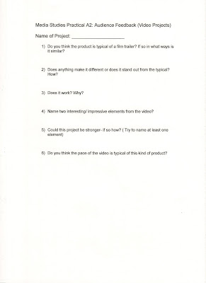
1) Do you think the product is typical of film trailer of the social realism genre? If so in what ways is it similar?
2) Does anything make it different or does it stand out from the typical? How?
3) Does the video help establish the genre of the film? How?
4) Name two interesting/impressive elements from the video?
5) Could this product be stronger – if so how?
6) Do you think the pace of the video is typical of this kind of product?
In our group for some tasks we split into two so we could share the work load, so we have two audience feedback videos.
Looking at this audience feedback we realised that we had made the right decision choosing our target audience. The audience watched our trailer and could tell that the conventions we used were typical of the social realism narrative. They gave us feedback, about how we could have made the trailer better, although there wasn’t that much we could have done. The comment from one of the videos was that we could of experimented with different angles.
Use of Creative Technologies

We entered in words into the search bar to help find the track quicker, such as sad or horror.
![[youtube-screen-shot.jpg]](https://blogger.googleusercontent.com/img/b/R29vZ2xl/AVvXsEhZbuVqum1qd4SXxoUion-s4Jh8RUgiZkqoLAi6GRgvmpQg61wPLAwQzWMiBuZdEW3E6CuwvpYkSOw-hdgLo_OrysIWvzX0jyNz6yMs2gkaIWjHQSS_MKbwNK-SrK6DCIdEXqoGarXi3PQ/s1600/youtube-screen-shot.jpg)
For the editing of our film, we used a new package, Final Cut Express. We were taught, at its simplest form as training how to use Final Cut would take up time, which was time that we did not have to waste. Although learning more than the basic skills could have made our film trailer a much higher standard. Final cut Express did create problems for us when editing. Sometimes it wouldn't load up our video properly, and when it did, it added a grainy effect which made the video look slightly blurry. Problems exactly like this carried on happening through the course of making the project.
Final cut helped us to edit the raw footage and allowed us to be creative with effects and techniques to help our film look successful. Various scenes of the film were spread out on the timeline to help us see them in more detail. The music we chose was easily put onto the film and made each transition flow perfectly. We were unable to finish our project on time due to having to participate in group audience feedback. Otherwise our film would have been sorted out with time to spare.
Our projects key strengths was the research I think, as it was well looked into and our target audience enjoy the type of genre we wanted to portray. I think another key strength would be the way we switched scenes from a video camera effect (home movie) to the present time of Leah walking, running and being attacked.
A weakness of our project was the lack of varied shots of our film. The audience feedback from the audience came back as this so it wasn’t a surprise when they revealed it.
Overall I think our film trailer looked like the real article. It had varied shots and scenes that flick from one to the other, back and forth with quick sharp shots to show intense and feel to the film.
I think overall that our group worked very well together. We varied tasks so we all could have our fair share in the different activities.
If I was to re-do this project, I would make sure every task was complete when it was given out. A few tasks were done last minute which put strain onto the group which caused a few disagreements.
With all this in mind I am pleased with the final product of the film and all we have achieved in so little time.
This is our final film trailer product.
VENDETTA.
Audience Feedback Questionnaires

Sarah
Wednesday, 24 February 2010
Audience Feedback
This is the Audience feedback for our film trailor video project.
http://www.youtube.com/watch?v=yPUxYFhWTK8
Sarah and Rebecca
Saturday, 6 February 2010
Finished ancillary tasks - group work


Here are our completed ancillary tasks. We used the programs InDesign and PhotoShop to create these products.
Holly
Wednesday, 27 January 2010
magazine developing
Chloe
This is a print screen image of the magazine cover half finished. The colours red white and black are colours we originally picked however we also decided to incorporate the colour blue. Not only are the colours red, white and blue colours of the British flag (fitting in with our british socail realism genre) but the blue also makes the cover more interesting as there would have been too much red as the title of the magazine is red.
We have tried to replicate empire magazines style in order for the magazine to look as realistic as possible. We noticed that the cover normally sticks to one font but then has a different feature font fitting the film featured on the cover. We used our poster font of 'base 05' to continue our brand image and the same brand image is also maintained through the use of colour.
The picture we have used is also similar to the pictures on the posters (brick wall, back street scene)- i scene which is also present in the film and so the brand image is also incorporated through the picture used.
We havent used any other pictures on the cover as empire magazine often does as we wanted our picture to be the centre point of the magazine. The magazine still looks realistic as during research we found that some of the empire covers just had one main picture like ours.
We need to add more text to the right side of the magazine in order to achieve the jam-packed look empire magazine has.

